Reading DePIN Tokenomics Without the Hype
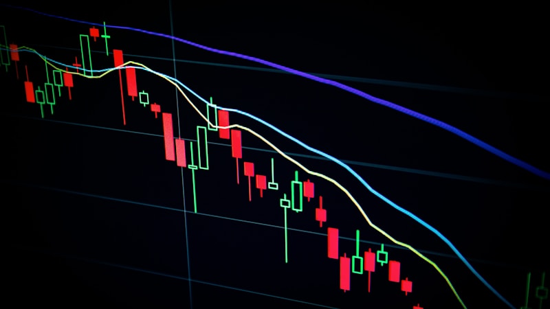
Tokenomics pages often lead with APY figures that assume full uptime, ideal geography, and stable token prices. Operators in Busan, Jeju, and rural Gyeongnam quickly learn those assumptions rarely hold. This article offers a worksheet mindset — not financial advice — for reading reward structures.
Step 1: Plot the emission curve
Locate the official emission schedule. Mark halving dates or decay functions. Calculate your expected share at current operator count, not at launch-day counts. If the document only shows "max supply," dig for weekly mint logs or on-chain dashboards.
Step 2: Model hardware as a depreciating asset
GPUs, mapping cameras, and outdoor antennas lose value and draw power. Include electricity at local KRW/kWh rates, internet redundancy, and mounting hardware. A node that earns tokens but costs more to run than a cloud alternative is an hobby expense, not a business line.
Step 3: Check geographic saturation
Most DePIN maps publish density heatmaps. Enter your coordinates and read adjacent cell occupancy. Marginal reward per new node drops sharply once a hex hits protocol-specific thresholds. Our glossary entry on density threshold explains common patterns.
Step 4: Separate protocol revenue from speculative premium
Ask whether anyone pays fiat or stablecoins for the underlying service — bandwidth sold, renders completed, imagery licensed. Token price may reflect speculation far ahead of usage. Note the gap explicitly in your notes.
Red flags in token docs
- APY cited without defining denominator (staked tokens vs. hardware cost)
- No slashing conditions described
- Migration terms that leave legacy holders with unclear conversion ratios
- Reward boosts labeled "limited time" without on-chain sunset timestamps
Want a facilitator to read token docs alongside you? See our briefing session or contact us with your project name.